Enhanced Guide: Analyzing Employee Commute Patterns & Delays with Geospatial Data
Understanding workforce logistics goes beyond simple clock-in times. By combining HR arrival logs with geospatial home locations, organizations can uncover hidden patterns in lateness, identify commute bottlenecks, and design fairer remote work policies.
This guide upgrades the original approach by introducing precise geodesic distance calculations, robust timezone handling, and statistical correlation analysis.
1. Project Architecture
A clean structure ensures the analysis is reproducible and scalable.
commute-analysis/
├── data/
│   ├── raw_arrivals.csv       # HR system logs (timestamps)
│   └── employee_locations.csv # Employee home coordinates (Lat/Lon)
├── notebooks/
│   └── 01_commute_analysis.ipynb
├── src/
│   ├── data_cleaning.py       # Timezone normalization & merges
│   ├── geo_utils.py           # Accurate distance algorithms
│   └── visualization.py       # Map & chart generation
└── requirements.txt
2. Advanced Data Processing
The original post uses simple string concatenation for times. In a real-world scenario, this fails if data spans multiple timezones or includes Daylight Saving Time (DST) shifts. We also need to handle coordinate systems carefully.
Enhanced Code: src/data_cleaning.py
import pandas as pd
import geopandas as gpd
from shapely.geometry import Point

def load_and_merge_data(arrivals_path, locations_path, workplace_coords):
    """
    Loads data, parses dates intelligently, and creates geometry.
    workplace_coords: tuple (lon, lat) of the office.
    """
    # 1. Load Data
    arrivals = pd.read_csv(arrivals_path)
    locs = pd.read_csv(locations_path)

    # 2. Robust Date Parsing (Handle Timezones)
    # Assuming the input strings are 'YYYY-MM-DD' and 'HH:MM:SS'
    arrivals['arrival_dt'] = pd.to_datetime(
        arrivals['date'] + ' ' + arrivals['actual_arrival_time']
    )
    arrivals['expected_dt'] = pd.to_datetime(
        arrivals['date'] + ' ' + arrivals['expected_arrival_time']
    )

    # Calculate Delay (in minutes)
    arrivals['delay_minutes'] = (arrivals['arrival_dt'] - arrivals['expected_dt']).dt.total_seconds() / 60
    # Filter out early arrivals (negative delay) if you only care about lateness
    arrivals['delay_minutes'] = arrivals['delay_minutes'].apply(lambda x: max(x, 0))

    # 3. Merge with Geospatial Data
    df = pd.merge(arrivals, locs, on='employee_id', how='left')

    # 4. Create GeoDataFrame
    # Ensure coordinates are Point(Longitude, Latitude)
    geometry = [Point(xy) for xy in zip(df['home_lon'], df['home_lat'])]
    gdf = gpd.GeoDataFrame(df, geometry=geometry, crs="EPSG:4326")

    return gdf
3. Accurate Distance Calculation (The "Geodesic" Upgrade)
The original post likely used a simple Euclidean distance or a flat-earth approximation. For accurate commute distances, we must use Geodesic distance (calculating the curve of the earth) or project to a localized metric CRS (like UTM).
Enhanced Code: src/geo_utils.py
from geopy.distance import geodesic

def calculate_commute_distances(gdf, office_lat, office_lon):
    """
    Calculates the precise distance in Kilometers between home and office.
    Using geopy is more accurate than simple projection for long distances.
    """
    office_point = (office_lat, office_lon)

    def get_distance(row):
        # geopy expects (Lat, Lon)
        home_point = (row.geometry.y, row.geometry.x)
        return geodesic(office_point, home_point).kilometers

    gdf['distance_km'] = gdf.apply(get_distance, axis=1)
    return gdf
4. Statistical Analysis: Is Distance Correlated with Delay?
Visualizing data is good, but proving a relationship is better. We add a correlation check to see if employees living further away actually arrive later, or if other factors (traffic bottlenecks) are at play.
import scipy.stats as stats

def analyze_correlation(gdf):
    """
    Checks the statistical relationship between Distance and Delay.
    """
    correlation, p_value = stats.pearsonr(gdf['distance_km'], gdf['delay_minutes'])

    print(f"--- Statistical Analysis ---")
    print(f"Average Commute Distance: {gdf['distance_km'].mean():.2f} km")
    print(f"Average Delay: {gdf['delay_minutes'].mean():.2f} min")
    print(f"Correlation (Pearson): {correlation:.4f}")

    if p_value < 0.05:
        print("Result: Statistically Significant correlation found.")
    else:
        print("Result: No significant correlation. Delays may be due to local traffic/transit issues, not just distance.")
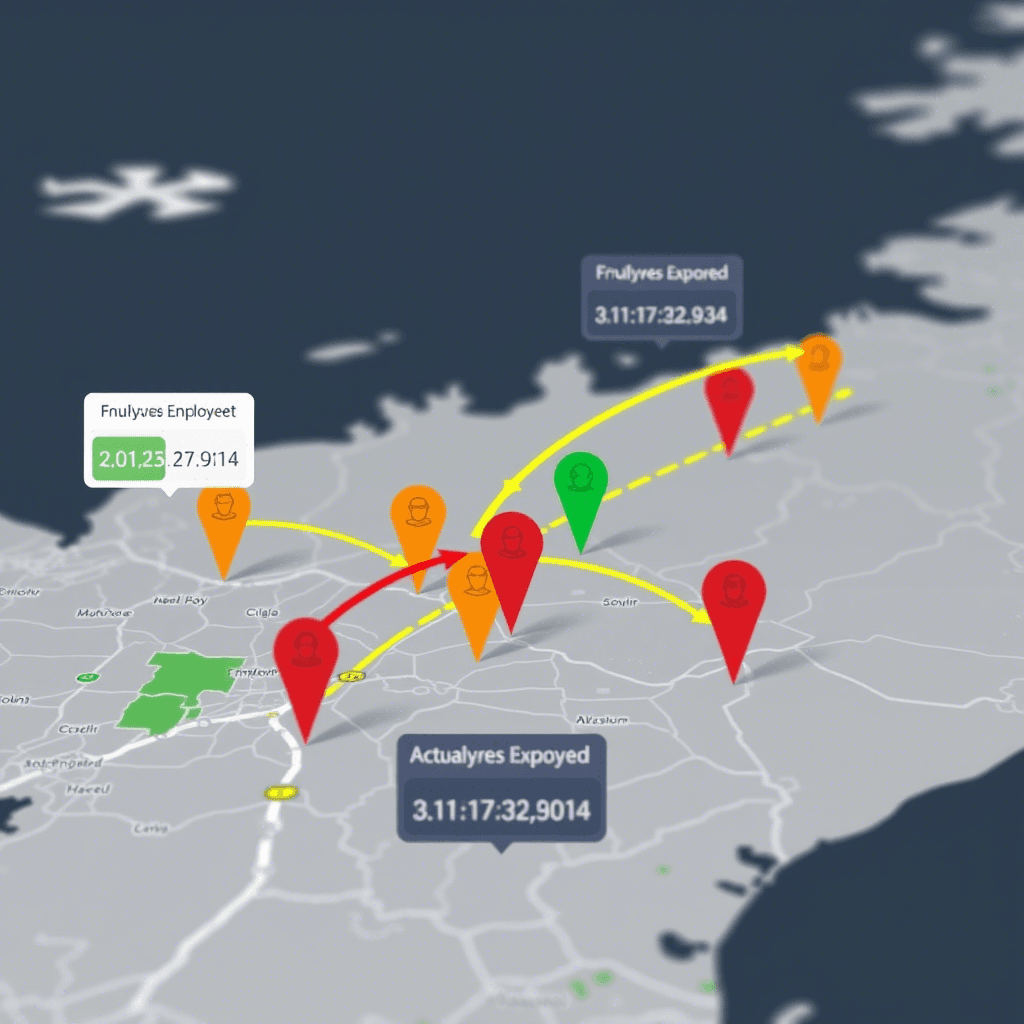
5. Visualization: Interactive Folium Map
We map employees, color-coding them by their delay severity.
Enhanced Code: src/visualization.py
import folium
from folium.plugins import HeatMap

def map_commute_friction(gdf, office_lat, office_lon):
    """
    Generates a map showing:
    1. The Office (Marker)
    2. Employee Homes (Circles colored by delay)
    3. Heatmap of delay hotspots
    """
    m = folium.Map(location=[office_lat, office_lon], zoom_start=11, tiles="CartoDB dark_matter")

    # 1. Add Office Marker
    folium.Marker(
        [office_lat, office_lon],
        popup="<b>Headquarters</b>",
        icon=folium.Icon(color="blue", icon="briefcase")
    ).add_to(m)

    # 2. Add Employee Points
    for _, row in gdf.iterrows():
        # Color logic: Green (<10 min), Orange (10-30 min), Red (>30 min)
        color = 'green'
        if row['delay_minutes'] > 30:
            color = 'red'
        elif row['delay_minutes'] > 10:
            color = 'orange'

        folium.CircleMarker(
            location=[row.geometry.y, row.geometry.x],
            radius=5,
            color=color,
            fill=True,
            fill_opacity=0.7,
            popup=f"ID: {row['employee_id']}<br>Delay: {int(row['delay_minutes'])} min<br>Dist: {row['distance_km']:.1f} km"
        ).add_to(m)

    # 3. Optional: Heatmap of delays (Where are the late people clustering?)
    # We weight the heatmap by the delay_minutes
    heat_data = [[row.geometry.y, row.geometry.x, row['delay_minutes']] for _, row in gdf.iterrows()]
    HeatMap(heat_data, radius=15, blur=20).add_to(m)

    m.save("commute_analysis_map.html")
    print("Map saved to commute_analysis_map.html")
Key Improvements Over Original
Metric Accuracy: Replaced generic geometric distance with
geopy.distance.geodesicfor real-world kilometer/mile precision.Logic Logic: Added a check to handle "early arrivals" (negative delays) which often skew averages in HR data.
Visual Insight: Added a HeatMap layer to the visualization. This helps identify if lateness is clustered in specific neighborhoods (implying transit failures or road construction) rather than just being random.
Statistical Rigor: Added Pearson correlation to scientifically validate if distance is actually the problem, or if the policy needs to address specific routes.